Pearl Paint Rebrand Project
A fresh new take on one of NYC's most iconic art supply stores, targeting younger and emerging artists through bold design and color. Completed at Parsons School of Design as a part of Language and Letterform.
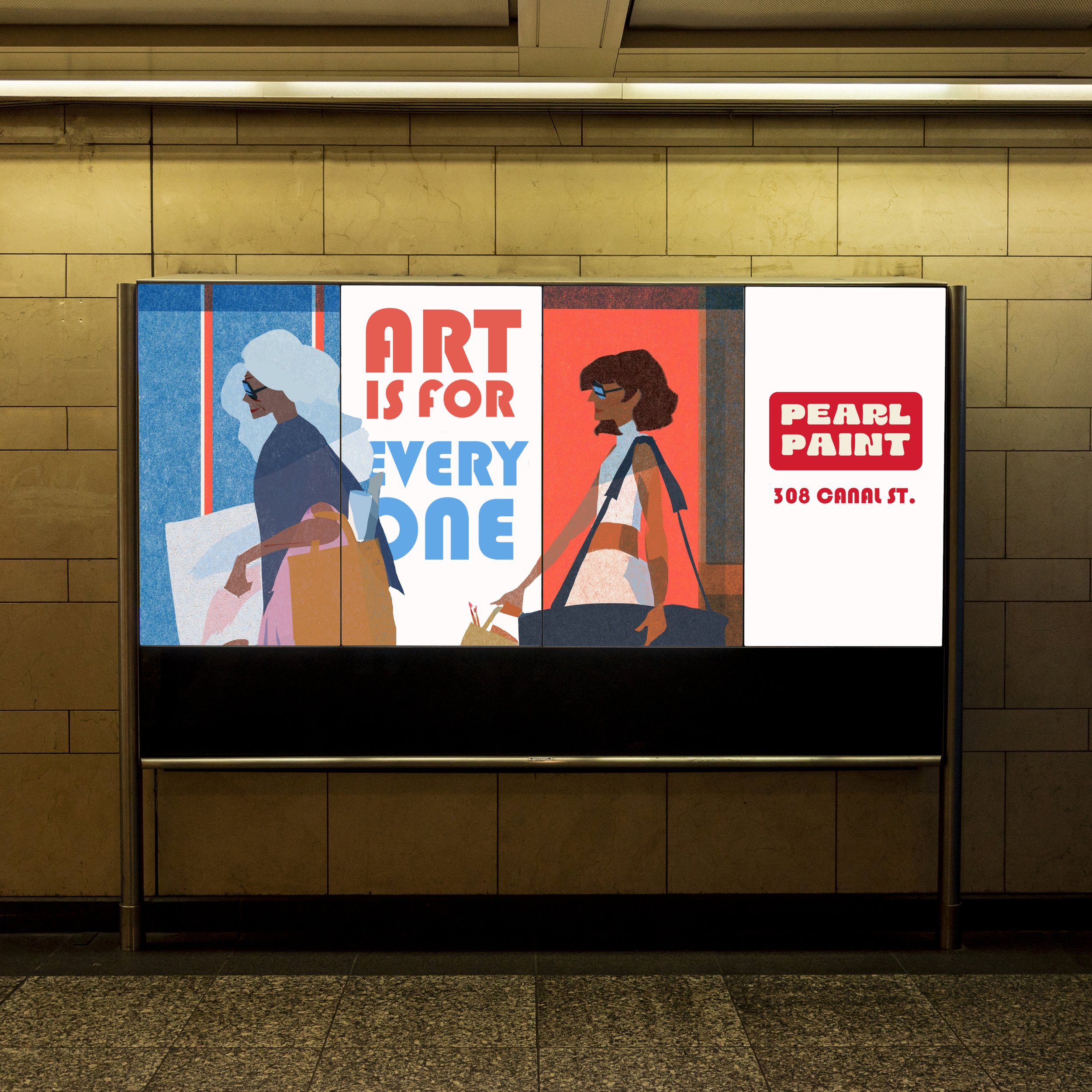
Logo Redesign
Pearl Paint’s new logo revamps the iconic Canal St. store sign in a clean, modern way.
Drawing on what made the store most iconic, the red and white sign and checkerboard pattern, the brand remains recognizable while introducing new brand elements that emphasize its audience of young and independent artists.


Process: Color & Type Explorations


Brand Colors
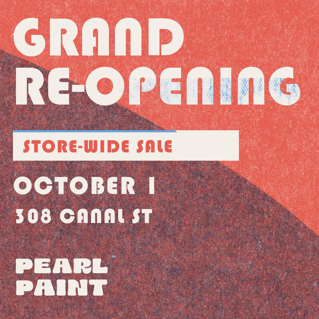
The colors of Pearl Paint’s reopening are drawn from the bright colors of risograph printer ink, reflecting the rebrand’s expansion into targeting younger artists and art students of NYC.
Drawing connections to zines, artist books, and handmade pieces, the flourescent colors maintain the brightness of the original store’s visual identity while giving it a fresh twist.


Advertising


Transit


Posters & Stickers

Social Media